Wednesday, June 10, 2009

TC Shirts

I made these the summer of 2006. Possibly doing a comeback this Summer. We shall see...


Monday, June 8, 2009

Final PIRATE DINNER INVITES

Final VUDONI project, unique typeface

This special product made unique for a class is a collector's item. All hand crafted included the commissioned Vans collaboration. There in the world exists only one! Includes TrueType Font install file as well as an instructional readme for 3D use. $159.99 - Please inquire at matthew.vu3@gmail.com. I take paypal! Shoe size is a men's 8.5 or women's 10.


more pirate process.


i have my process on flickr but these two are what i landed for inside and outside cover.


the very top one is the inside with the copy, the second one is the outside cover....i reworked this one though its not tilted and the layout is a tad bit different...but i did use this same typeface.

Thursday, June 4, 2009

Pirate Pop Up Party


This is just in the works......copy and color added later.

???


right click and view picture!

Tuesday, May 26, 2009

2/3 finished

Local artists. I am trying to work the copy. Some minute fine tuning but learning some techniques here were definite eye-openers (ie soft light mode, filling patterns, color overlays, satin overlays, gradient overlays).


Tuesday, May 19, 2009

FONT FIGHT

Rad Maker Poster series

I'm doing a rad maker poster series incorporating upcoming artists of Tha Union. Here is my process thus far, updates are imminent.


Vudoni Shoe Dust Bag

I've finally received my spoonflower fabric with my all over Vudoni print. I need to send it to my uncle to have the dust bag sewn but it will be like a drawstring shopping bag. The shoes will fit in it and then into the box as well.

Friday, May 8, 2009

REDEMPTION IS HERE...final box

ok, so I found a white box that I had to put together myself but that's okay because it was white and blank to begin with. I also found letters myself and decided to go with the red and cyan instead of a white. I also already chose the order I want to put them in and have set them in already but just showed you that I did play around with arrangement. SOOOO much better...and the cd holder inside will be improved as well. just gotta wait for those damn shoes.


Thursday, April 30, 2009

Vudoni typeface for download!

I've uploaded the typeface I've created myself for you to install and I've included a read me file on how to turn your type into 3D!

ENJOY!

Tuesday, April 28, 2009

Final Type Project

Ok, I'm glad I went through this in class already and got my feedback so this is a post after bringing everything into class. I now have a new and clear cut goal in mind. So everything is all good except for the box. The box was a miserable failure. I took a lot of time with it just because it was extremely difficult and I felt like I was in too deep to quit which is why I brought it into class. Having learned it, I've decided to make those draw string gym bags similar to what Nike does. I have an uncle that is a tailor who provided the material, could probably grind out a professional looking one out in the matter of minutes. Given that, here are the pictures:


the abomination of a package:


...its redemption time...

Wednesday, April 22, 2009

Hang Tag bluuuuues

I designed the hang tags for the type face and ran into a couple issues. Do I want to do it back sided or not? If I did, I could try printing them double sided or I could apply the two together via spray mount that have been separately printed and then cut them in the end. However, I think the best solution to this would be two hang tags. I think if I were to get a shoe with two hangtags I would think its cool that I get more than one, and if I really dislike one "side" of them I can easily discard it. Did a test print and already ran into a design problem, where I am to install the eyelits for the hangtags, it runs right into the content of the history. I will resize them down tomorrow for the final print. Here is a picture of what's going on:

Tuesday, April 21, 2009

Typography Project in Further Detail

the holder for the cd and glasses, as well as the box sanded down, painted and worked

So here's pretty much a check list of things I want to do. Keep in mind it is not in sequential order. I will also give a quick synopsis of how I will go about accomplishing these different tasks.

-Heel patch of 3d glasses
i went to joannes fabrics and bought some iron on cloth and got some samples of red and blue canvas (similar to the stuff the actual shoes are made of)

-wrapping paper for the shoes with an all over print on one side and a type specimen mini poster of the Vudoni typeface.
i had it printed double sided and i had experience making an all over print from before. this step is actually already done.

-holder, i need to think of a way...im thinking using some envelopes and gluing it to the inside of the box after it has been painted and finished.
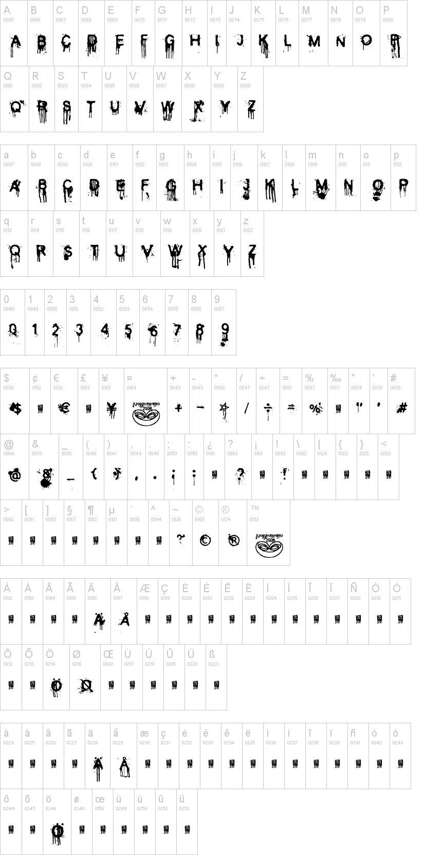
-cd - light scribe
i just need to find a light scribe cd, and finish the type face. after that i will also write instructions on how to use the face.

-hang tag
design the hang tag, print it on a hard stock, cut it out and hole punch it and do a metal eyelet for the hang tag.
the hang tag will have the face on one side and the history of the birth of Vudoni on the other side.

Saturday, April 18, 2009

Packaging Concept

so the concept will be promotional shoes with the typeface. i ordered some custom vans new era shoes in the red/cyan motif however after ordering it said that the shoes will be delivered in 7 weeks...which is when the portfolio is due O________O;

however, i will have everything ready up until then...i will have the 3d glasses heel patch made, the wrapping paper for the shoes, the holder for the cd and glasses, as well as the box sanded down, painted and worked. i have attached the concept for the wrapping paper that will be printed on 12" x 18" paper printed courtesy of the big homie Nate. im really excited for this project but am having high anxiety due to these damn shoes taking so long. i will be calling vans this monday to inquire about having them rushed at least a week prior to the portfolio review. i promise: this will be a dope ass project.

lonely dinosaur

found these guys at the saturday market last year, im sure they'll be around this year when it opens back up. best t shirt ever.

Saturday, April 11, 2009

Final Design for Type Project

Now that I've dedicated a solid 48 hours on this type face and after putting on the finishing touches, its time to move onto that darn wordless cookbook in 225 and dedicate another solid 48 hours on that project. le sigh.

Friday, April 10, 2009

The 3 V's.

Peep game, I saved the best for last (literally).


Short project break

Surfing my blog roll and found this: a clever Upper Playground shirt doing a parody on the Son of Man by Magritte.

Next step, vectorize image NOT using live trace

this is the completion of the next step after scanning in a hand rendered set. this took me much longer than anticipated as i did not use live trace and facebook is a terrible distraction.

Type project progression

We all had small groups and after some conceptualizing I wanted to first nail down the technique of 3D. Kate suggested I create my own type face as it would be completely my own. After reading some classic old school 3D comics, I wanted to use a fat black marker and use my own hand writing. What could be better than having your own handwriting in 3D!??

Here's me nailing down the technique (3D glasses required)


Here's the type list, I still need to come up with a name I'm excited about...I've thought about "Anaglyph" but that's so technical and boring.

Thursday, April 9, 2009

A Brief History of Type!

This was quite an interesting read. There is a significant role that religion played in the history of the printing press. Without the printing press, specific religious groups wouldn't have been able to quickly spread the word about their groups and may have not been able to exist until today had it been for the printing press. During the industrial revolution was the automatic mechanic printing press! This all happened mid to late 1800's. There's a plethora of letterforms. I can definitely appreciate the old style and the transitional. I also am an aficionado of decorative fonts that heavily incorporate non type visuals!

Friday, April 3, 2009

type project concept 3

I feel strongest about this and will await feedback but an anaglyph alphabet. Inspired by B sci fi movies in 3D and the concept of 3D anaglyph images and movies, create a letter set on anaglyph. Each individual letter will have to be rendered because they have to be split into a left and right images. From there, the image has to be adjusted to maximize perspective. Here are some images that have inspired me:


Packaging and promotional ideas would be really fun. T-shirts, posters, stickers, anything that can be printed on. Of course, included in the package will include a pair of 3d glasses. I will look at graphic-exchange.com for inspiration on packaging.

type project concept 2

I wanted to play with geometric figures maximizing the space used within that geometric figure. using a similar pattern to this:


However, I could use a circle for al letter types instead of a kinkos-esque geometric figure. Essentially, all letters are in circle and minimizing the amount of counter space used. It will have to be extremely experimental as I would want to stay away from adding anything outside of the circle.


type project concept 1


Using a scanner and saran wrap, I could do letter type utilizing fake blood. Making my own alphabet will be unique as no matter how often you do the same letter, they will never be exactly the same.Here are some tutorials on making fake blood.

Here is an example of a digitized alphabet set:

Wednesday, April 1, 2009

THIS IS...

WHY I LOVE TYPE.

This music video directed by French graphic designer So-Me is one of the reasons why I fell in love with type. Not only is it the most bad ass song in the entire history of the universe but the type has a definite influence of my childhood of the 80's, early 90's. You can see an influence from logos done by Paul Rand and Saul Bass. You may have recognized the video he directed for Justice's "D.A.N.C.E." He also designs most of Justice's graphic work. He also directed Kanye West's "Good Life" music video.


Justice - DVNO

here's a link to d.a.n.c.e.

About Me and a few Interesting Typefaces

Some of your favorite type faces: Futura, Busorama, I beat Helvetica to death so now I'm really on Cooper (180, I know). It doesn't work for everything and I enjoy that challenge.

what are you excited about? I'm an 80's baby so I'm excited about how the current trend are retro 80's inspired pop-culture. I'm also excited to see what direction pop-culture goes next.

favorite books & magazines: Where the Wild Things Are (stoked for the movie especially with Spike Jonze direction), Understanding Comics by Scott McCloud, American Shaolin (Fun and easy read) by Matthew Polly, GQ, Forbes, Giant Robot, Complex

favorite websites: backonmybullshit.blogspot.com (shameless plug), smokingsection.net, hypem.com, asianmandan.com, fighting44s.com, angryasianman.com, hypebeast.com, kanyeuniversecity.com/blog, bbcicecream.com/blog


Steve Matteson


Tom Carnase


Oswald Cooper


Paul Renner


Robert Slimbach


Max Miedinger


Geoffrey Lee


Hermann Zapf


Barbara Lind


Carol Twombly


Vincent Connare


Hermann Zapf